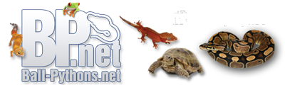







Ok... I'm on this CRAP monitor, and the colors are all........
But Just from looking at the design, it seems like it's competing with it's self...
On first glance I would flip the Skink and the Boa... Boa at the same angle as the broken glass part on the left....then the Skink flipped with it's tongue towards P&C (I mean t) And Maybe soften the font a bit?
All in all I like it PC!!~!!

 Reply With Quote