Huh - I wonder what's causing that. I'll look into it and see what I can do.
Originally Posted by PitOnTheProwl
Looks good.
Thank you!
Originally Posted by Megg
Looks great on mobile!
Thanks!
Originally Posted by Reinz
Very nice and clean!
Looked great on my IPad. I just easily slid things with my finger to read some things.
Thanks! Does your iPad have the same formatting on the Availability page as Felidae showed the screen shot of earlier?
Originally Posted by rlditmars
The pages and content look great and are easy to navigate. If I can make one suggestion, it is to make all of the Header Titles (i.e. My Short Biography) the same color font. Usually when I see a darker font I receive it as an emphasis. In the instance I cited above, I would expect the word Biography to be emboldened or darker. Anyways, those are my thoughts. Best of luck going forward with it.
Much appreciated. I hadn't even thought about the perception of the lighter/darker headings. Hmmm...
Overall, very nice, however depending on which monitor I'm on, it won't resize properly. My 1080x1920 portrait monitor requires horizontal scrolling, you may want to see if you can adjust your minimum size down on the autosize. If it's an option on your system, you can set it to convert some menu listings to a misc dropdown that has them as mine does with thinner screen widths.
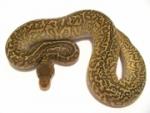
1.0 Josiah - Super Pastel het SK Axanthic
0.1 Abigail - Spider het SK Axanthic
1.0 Moqui - Pug - Rescued from a Meth lab
1.0 Winston - Min-Pin, Chihuahua, Dachshund mix, rescue
1.0 Buddha - Gray Tabby - baby of a neighborhood stray we took in
1.0 Precious(like the ring) - Siamese - Sister to above










 Reply With Quote
 Originally Posted by Felidae