» Site Navigation

0 members and 1,587 guests
No Members online
Most users ever online was 47,180, 07-16-2025 at 05:30 PM.
» Today's Birthdays
» Stats
Members: 76,090
Threads: 249,231
Posts: 2,572,851
Top Poster: JLC (31,651)
|
-
Logo
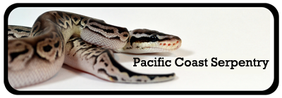
My snakes are finally getting to breeding size and this year I should hopefully have a few *fingers crossed* litters. I am also really big into doing educational shows. I have done a small handful however looking to do a lot more this coming year. To do shows most people want it to be a business so they are not liable for accidents. Anywho so I am trying to come up with a logo and had someone come up with these three concepts. Which one do you like? I am leaning towards the one on the left (Concept 2) although not sure of the color. However I think someone might already have a logo that looks like that.
What do you think? I can ask for him to revise it and open to ideas!

-
The Following User Says Thank You to M&H For This Useful Post:
-
Re: Logo
Concept 1: Cool looking for a tattoo style. It's too busy and makes me not want to try figuring out what it says.
Concept 2: Plain, simple, smooth, the size and snake design gives it a little "in your face" attitude. I like it. Take the colors of concept 1 and see how it comes out? Just to play with it a little. Might depend on the background you put it on as well. Needs a little "flare" IMO, but I could be wrong on this part. Otherwise, I think you're good here and the more I look at, the more I like it.
Concept 3: I like it, but feels like something is missing. It reminds me of a title of a kids book or branding of a publishing company.
-Yar 
1.0.0 Albino Black Rat snake(Wafer)
0.0.1 California King snake(Oreo)
0.0.1 African Housesnake(Cupcake)
0.0.1 Honduran Milk snake(Blackjack)
0.0.2 Normal BP(Petey; Twix)
0.0.1 Yellow Rat Snake(Dijon)
0.0.1 Madagascar Speckled Hognose(Granola)[RIP]
1.0.0 Albino Nelson's Milk snake(Candy Cane)
1.0.0 Lesser BP(Creme Brulee)
1.0.0 Mojo BP(Brownie)
0.1.0 Black Motley Corn snake(Anisette)
0.0.1 Pueblan Milk snake[Fostering, Taco Grande]
0.1.0 West African Mud Turtle(Bulger)
0.2.0 Red Eared Slider(Squirtle, Turtwig)
1.0.0 Rat Terrorier(Ranger)
-
-
BPnet Veteran


Logo
#1 I like most because its the coolest looking. but #2 is the cleanest and easiest to read. maybe try changing the color green? it reads reptile better :b
-
-
Logo
I tend to think the same. I love 1 but its a gradual thing, my eyes just kind of skipped over it because of how busy it was at first glance. 3 really doesn't hold my attention either, not sure why. I am not a big fan of red but I love number 2.
-
-
BPnet Veteran
Logo
as a graphic designer myself, I personally like #1
-
-
I love the second one. #2 FTW
1.0 Boxer (Boba
@bobatheboxer on IG)
-----------------------------------------------------------------
"Blaming the leader of the fools should not blind anyone to the vast confederacy of fools that made him their leader."
~unknown~
-----------------------------------------------------------------
SUPPORT OUR WOUNDED WARRIORS
-----------------------------------------------------------------------------------------------------------
-
-
I like Concept 2 except with concept 3's font and wording.
I'm not really liking Concept 2's font.
Concept 1 is too busy for my liking. And I just don't like the graphic to Concept 3.
-
-
Thanks everyone for your input, I really appreciate it. I asked him to rework Concept 2. I liked the idea however I didn't like that the name was awkwardly cut off. I asked for "Stare Worthy" to be on all one line. I also asked for a bit of color like concept 1 and the font from concept 3. This is what I was sent back.

Now what do you think? 
-
-
Re: Logo
 Originally Posted by M&H

Thanks everyone for your input, I really appreciate it. I asked him to rework Concept 2. I liked the idea however I didn't like that the name was awkwardly cut off. I asked for "Stare Worthy" to be on all one line. I also asked for a bit of color like concept 1 and the font from concept 3. This is what I was sent back.
Now what do you think?
At first i thought you forgot how to post pictures, but I'm "replying with quote" and there is a little box that says image. So perhaps it did not load or get pasted properly. Unless my comp is just not showing it.
Short answer:
I don't see the picture.
-Yar
1.0.0 Albino Black Rat snake(Wafer)
0.0.1 California King snake(Oreo)
0.0.1 African Housesnake(Cupcake)
0.0.1 Honduran Milk snake(Blackjack)
0.0.2 Normal BP(Petey; Twix)
0.0.1 Yellow Rat Snake(Dijon)
0.0.1 Madagascar Speckled Hognose(Granola)[RIP]
1.0.0 Albino Nelson's Milk snake(Candy Cane)
1.0.0 Lesser BP(Creme Brulee)
1.0.0 Mojo BP(Brownie)
0.1.0 Black Motley Corn snake(Anisette)
0.0.1 Pueblan Milk snake[Fostering, Taco Grande]
0.1.0 West African Mud Turtle(Bulger)
0.2.0 Red Eared Slider(Squirtle, Turtwig)
1.0.0 Rat Terrorier(Ranger)
-
-
Re: Logo
Originally Posted by Pyrate81
At first i thought you forgot how to post pictures, but I'm "replying with quote" and there is a little box that says image. So perhaps it did not load or get pasted properly. Unless my comp is just not showing it.
Short answer:
I don't see the picture.
Thanks. Wonder why I can see it but no one else can? Let me try this again I'm not the most tech savvy person.

-
Posting Permissions
- You may not post new threads
- You may not post replies
- You may not post attachments
- You may not edit your posts
-
Forum Rules
|


 Reply With Quote