» Site Navigation

2 members and 675 guests
Most users ever online was 47,180, 07-16-2025 at 05:30 PM.
» Today's Birthdays
» Stats
Members: 76,060
Threads: 249,212
Posts: 2,572,739
Top Poster: JLC (31,651)
|
-
 Logo Ideas Logo Ideas
So as a current graphic design student, I've decided to try my hand at making my own business logo, as far as the business of ball pythons go. These two concept are what I just popped out tonight after some refinement to my initial ideas .My "first" first ideas didnt make it too far but are still simmering in the back of my head.
The business name I've chosen is "Michigan Painted Pythons". I got the idea from the states reptile being the 'painted turtle' and was trying to tie that idea into a somewhat artistic meaning, where as the 'paint' would also mean the colorful snakes I'd produce.
The main difference between these two concepts is one fully spells out 'Michigan' and the other uses the abbreviated 'Mi' version as well as slightly different fonts. The eventual website will be Mipaintedpythons.com but I'm not sure if its appropriate to use the abbreviated version in the logo.
I don't want it to look overcrowded by letters but I don't want it to look like I cut corners to much by only using 'Mi' in the logo since some people unfortunately think 'Mi' means mississippi, the Mi may lead to eventual confusion perhaps.
Other minor differences is the letter spacing, where as some letters are touching the blocked letters above. There was a initial reason for the letters touching and that was to make it look like some of the letters in the word 'python' had dripped out of the word 'painted'. I started feeling like that was pushing the idea too much so I stopped, I just don't want the blocked letters to come off as plain, I may still add 'drips' to them somewhere just to still get some of that paint feel.
And I know its black and white now but what most of my design teachers say is that it needs to work in black and white first, then you figure out your color scheme, so that's how I'm going.
I need lots of opinions.


Last edited by Meltdown Morphs; 03-06-2013 at 04:03 AM.
0.1 GHI Mojave
0.1 Super special h scaleless
0.1 Desert ghost
1.0 WC Dinker
-
-
heyyy i'm a graphic design student as well! fun stuff. on the first one, when i see "Mi" i don't think mississippi or michigan, but for some reason it makes me think "mi" as in "my" in spanish. like "my painted pythons." i think it may work better with the capital "MI." I'm not crazy about Michigan typed out on the second one. it may just be the font, but it reminds me of the Michelin tire logo. lol
also, i don't know if you're still not finished with adding the letters or if you were using the snake as the "P" for both the words. if the snake is being used as a letter, it took me a while to see it. i just saw "ainted ythons" for a couple minutes. other than that, i love the font. i think the boxed in letters go well with the word "painted," like little painted signs. if you're going to use the snake as the letter P it needs to be a lot more prominent so we know for sure what we're reading, and this can kind of be difficult to pull off beautifully.
just an idea, and you can chuck this one in the trash if you don't like it, but you could scrap the snake completely, add on the P's to the beginning of the words in the same font, and put more work into the "drips" you were talking about. i really like that idea. or maybe make them look like spray paint stencils with some overspray. not so sure about "python" dripping out of "painted," but maybe drips coming down off the word "painted" with the "python" font kept as it is. just throwin out ideas. lol
by the way, michigan painted pythons is an awesome name.
Last edited by TheSnakeGeek; 03-06-2013 at 04:56 AM.
-
-
The "Mi" definitely doesn't work. Stick with "Michigan". I would also change the angle of tilt on the blocked letters as most of them seem to just be leaning to the right like they're eventually going to fall over. I would mix it up and have some leaning left and some leaning right...more random. Like this http://www.shutterstock.com/pic-4689...ote-style.html
I like the mix of fonts used.
And the actual snake doesn't really work as a "P" imo. It's also very detailed for a logo graphic...it's more of a "drawing" than a graphic. I would simplify it or stylize it more so it's easier to apply to things like business cards, websites, t-shirts, coffee mugs without the image getting muddied up...
Hope this helps! 
- - - Updated - - -
 Originally Posted by creepin

but for some reason it makes me think "mi" as in "my" in spanish. like "my painted pythons."
That was exactly what I thought too...
Lucifer Sam, Siam cat...
Always sitting by your side,
Always by your side...
That cat's something I can't explain...
-
-
-
-
Logo Ideas
MP Sqaured=
Michigan Painted Python
-
-
Logo Ideas
I agree with all the others, and I also like the idea of using what looks like stenciled lettering with a little over spray. I think that would look sweet. I had a hard time finding the 'P' too... But I do like the idea of using a snake as your P. 'ainted' could look really cool if it looked like it was painted on, too! Cool name!
Sent from my iPhone using Tapatalk 2
Kimbly  Pastel 'Cami' Mojave 'Tank'
Kingpin 'Cleo' KillerBee 'Buzz'
Pied 'Patches' Lesser 'Lieutenant Dan'
Mojave 'Lyla' Het Pied 'Norm'
2 Normals 'Audrey' and 'Girl' Fire 'Smokey'
Black Pastel '#3' Normal 'Slim Shady'
Butter
Sassy and Reilly, our furry girls
Gabrielle, Brynn, Samuel - our human kids
-
-
Alright , now that I know this version of the giant 'P' snake isn't working it will have to come out.
Reason it stuck around to this point is I wanted to use an image from one of my actual snakes it was going to be reduced so it wouldn't be so sketchy looking, maybe just reduce it down to a silhouette where there's still a snake head somewhere.
I just don't want the word 'pythons' to have to be the only reference to a snake here. I didn't fully take into the fact that the only reason I could see it as a 'P' right off the bat is cause that's what I planned to see it as heh.
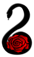
And I do like the one WildRose came up with, but for some reason that reminds me more of aquatics tho, like wet seaweed >_>
aaanyways off to round two.
0.1 GHI Mojave
0.1 Super special h scaleless
0.1 Desert ghost
1.0 WC Dinker
-
-
Logos can be tricky. I tend to prefer the very simplistic ones over the graphic heavy ones. I want a logo to be simple and creative. It doesn't have to have words in it. It doesn't have to have pictures in it or any sort of textural detail.
If you'd like, I can do some sketches for you this evening of something that I think would be really cool. I've done quite a few logos in the past and they have all received positive feedback.
-
-
yes theres colors in this one, I originally just put red in there so you could actually see the 'y' since it was a black on black overlap and I got a bit carried away with the other colors,but they are by no means permanent.
For some reason this one feels more 'noisy' than the previous one like I over did something but dont know what exactly,I really think I should have left everything else black and only 'y' red like I intended , and yes I threw in another snake image

And anyone can do sketches if they wish, it'll help me organize ideas, but this is mostly an endeavor that I really want to have done myself when it comes to the finished version, all help and suggestions/opinions are welcome.
I could probably easily reduce this down to a image with no words since a 'painted python' is not a difficult thing to imagine(pieds for example).I just think that would come after the primary image is settled then you go with the single image symbolic logos.But I could be completely wrong, I'm a learning student so I'm not saying 'no' to anything here. I'd love to see others sketches/ideas.
Last edited by Meltdown Morphs; 03-06-2013 at 02:15 PM.
0.1 GHI Mojave
0.1 Super special h scaleless
0.1 Desert ghost
1.0 WC Dinker
-
-
Logo Ideas
I really like the colored one. Only thing I would change is make the snake's head more detailed and defined. It's more a suggested shape as it is.
 Alluring Constrictors Alluring Constrictors
-
Posting Permissions
- You may not post new threads
- You may not post replies
- You may not post attachments
- You may not edit your posts
-
Forum Rules
|


 Reply With Quote