» Site Navigation

1 members and 593 guests
Most users ever online was 47,180, 07-16-2025 at 05:30 PM.
» Today's Birthdays
» Stats
Members: 76,070
Threads: 249,219
Posts: 2,572,800
Top Poster: JLC (31,651)
Welcome to our newest member, mh789
|
-
-
-
Looks very good! I need to get a Wacom.
-
The Following User Says Thank You to Royal Hijinx For This Useful Post:
-
Registered User

Amazing art!! And Arashi? As in the band?  
1.0 Pastel "Spot"; 1.0 Butter "Hyde"; 0.1 Bumblebee; Spider "Fang"; 1.0 Pastel YB; 0.1 Normal "Nagini"
0.2. Coastal Carpet Pythons (One currently MIA)
2.2 Kitties - Daisy, Ivy, Quincy & Eridan
-
The Following User Says Thank You to dragonsong93 For This Useful Post:
-
Re: Sharing Some Digital Art *critique please*
 Originally Posted by dragonsong93

Amazing art!! And Arashi? As in the band?
Thank you!
Yes. Arashi. As in the Japanese boy band. Haha.
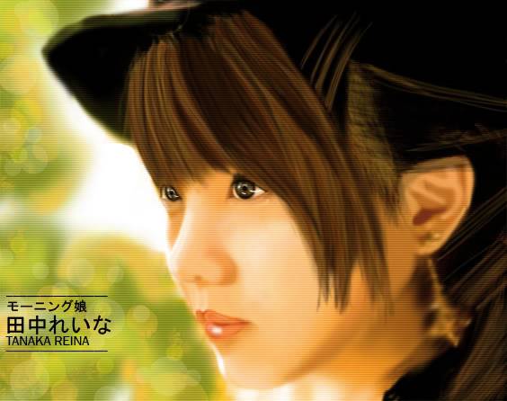
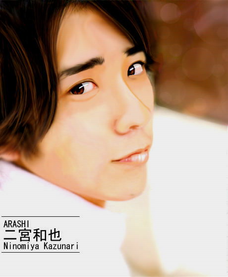
The first piece is one of their members.
When I was in high school, I used to be a huge fan.
-
-
wow thats good i have a Wacom tablet but cant make do anything like that lol.
Last edited by Wicked Constrictors; 06-07-2012 at 04:38 PM.
Wicked Constrictors
Jennifer
3.5 BPs......1.1 normal 1.1... mojo...1.0 spider Possible Het Pied...0.1 het Pied...0.1 Lesser...0.1 Pin
3.4 red tails...1.1 green tree python...0.1 burm...0.2 retic... 2 lizards...1.1 kids...1.0 husband
-
The Following User Says Thank You to Wicked Constrictors For This Useful Post:
-
Re: Sharing Some Digital Art *critique please*
Originally Posted by jinx667
Looks very good! I need to get a Wacom.
Thank you!
They're great tablets.
-
-
Registered User
Re: Sharing Some Digital Art *critique please*
Originally Posted by satomi325
Thank you!
Yes. Arashi. As in the Japanese boy band. Haha.
The first piece is one of their members.
When I was in high school, I used to be a huge fan.
I have some of their songs on my Ipod  I mostly listen to visual kei tho and not jpop stuff I mostly listen to visual kei tho and not jpop stuff 
1.0 Pastel "Spot"; 1.0 Butter "Hyde"; 0.1 Bumblebee; Spider "Fang"; 1.0 Pastel YB; 0.1 Normal "Nagini"
0.2. Coastal Carpet Pythons (One currently MIA)
2.2 Kitties - Daisy, Ivy, Quincy & Eridan
-
-
Very nice. You definitely have that painting technique down for sure. I'd be curious to toss you into CorelPAINT and see what you can come up with, given the larger variety of textures you can work with. Photoshop is great, but I find unless you import a variety of brushes, you can tend to lack a bit of texture here and there. These look very clean and smooth, which is great for portraits. Other subjects might lose a bit of that 'edge' they'd need.
If you're looking for a critique, I can provide a bit of one. No worries, though, I'm not a harsh one 
The only thing I'm feeling as I browse through these is they feel like they lack a bit of contrast. By appearences it looks like you went off photographs for the facial building, which is great. Photos, especially portraits, can really lack contrast sometimes or intentionally are lit to create different 'feelings'. I personally would have loved to see you sneak a bit of contrast color into the shadows, built a bit more highlight/dark along the edges (especially near the 'back' of the photo where you start to get into shadows). Even just cooling off the tone a bit on the face in certain shadowed areas would have been enough to break up a bit of that one-sided color palette.
I can see the variety of skin tones you used, which is great. That's not what I'm critiquing. I just mean I'd love to see the red and flesh tones pop a bit by adding some more 'green' to the shadows. Not straight green, obviously, haha. But a greyed out green instead of just a darker skin tone. It doesn't make sense when you first start playing with it, I know. But shadows are typically the color across from the highlight color on the color wheel. So for red/yellow hues, their shadows would tone into some greens and purples.
Haha. I had to play with making shapes and shadows for a while before I understood what someone was talking about with that. But once you get it, you can really take your work to that next level. We tend to focus so much on color with digital programs that we sometimes can forget a bit about color theory.
Like I said, this isn't a harsh critique. More like something to play around with later if you feel like you want to change it up and try a different style. Nothing wrong with these portraits. You have a beautiful bokah background, very nice levels of depth, softness fading away from the focal points... Nothing I'd tweak here. I'd just love to see how you would approach a more saturated and varied color palette if given the chance, especially with the soft painting style you have here
- Danielle
Snakes are just tails with faces....
1.0 Pied BP, 1.0 Crested Gecko, 1.0 RAPTOR Leopard gecko, , 0.1 Desert Pin BP, 1.0 Albino BP, 0.1 Leachie Gecko
-
The Following User Says Thank You to Vasiliki For This Useful Post:
-
Re: Sharing Some Digital Art *critique please*
ARASHI & M.M.! Haha.
Really nice. Love them both, but, the first more so. Haha. The shading is really nice, and so is the texture. I really like how the first one blends in with the background more so. They're both really, really nice! Keep up the good work!
P.S.: Asian Kung Fu Generation is better. Even though it's in a totally different genre :P
Last edited by Pampho85; 06-07-2012 at 05:23 PM.
-
The Following User Says Thank You to Pampho85 For This Useful Post:
-
Re: Sharing Some Digital Art *critique please*
Originally Posted by Vasiliki
Very nice. You definitely have that painting technique down for sure. I'd be curious to toss you into CorelPAINT and see what you can come up with, given the larger variety of textures you can work with. Photoshop is great, but I find unless you import a variety of brushes, you can tend to lack a bit of texture here and there. These look very clean and smooth, which is great for portraits. Other subjects might lose a bit of that 'edge' they'd need.
I agree with you 100%. I tried using Coral Painter a few times, but came out unsuccessful. I just couldn't figure out how to really use painter to it's full potential. Even basic stuff was difficult for me to use. (But this was years ago. I may give it a try again....)
Painter is much more complex imo. PS is more "dummy" status... heh...
If you're looking for a critique, I can provide a bit of one. No worries, though, I'm not a harsh one
The only thing I'm feeling as I browse through these is they feel like they lack a bit of contrast. By appearences it looks like you went off photographs for the facial building, which is great. Photos, especially portraits, can really lack contrast sometimes or intentionally are lit to create different 'feelings'. I personally would have loved to see you sneak a bit of contrast color into the shadows, built a bit more highlight/dark along the edges (especially near the 'back' of the photo where you start to get into shadows). Even just cooling off the tone a bit on the face in certain shadowed areas would have been enough to break up a bit of that one-sided color palette.
I can see the variety of skin tones you used, which is great. That's not what I'm critiquing. I just mean I'd love to see the red and flesh tones pop a bit by adding some more 'green' to the shadows. Not straight green, obviously, haha. But a greyed out green instead of just a darker skin tone. It doesn't make sense when you first start playing with it, I know. But shadows are typically the color across from the highlight color on the color wheel. So for red/yellow hues, their shadows would tone into some greens and purples.
Haha. I had to play with making shapes and shadows for a while before I understood what someone was talking about with that. But once you get it, you can really take your work to that next level. We tend to focus so much on color with digital programs that we sometimes can forget a bit about color theory.
Like I said, this isn't a harsh critique. More like something to play around with later if you feel like you want to change it up and try a different style. Nothing wrong with these portraits. You have a beautiful bokah background, very nice levels of depth, softness fading away from the focal points... Nothing I'd tweak here. I'd just love to see how you would approach a more saturated and varied color palette if given the chance, especially with the soft painting style you have here
Thank you for the advice. I really appreciate it. I'll be sure to try out your suggestions.
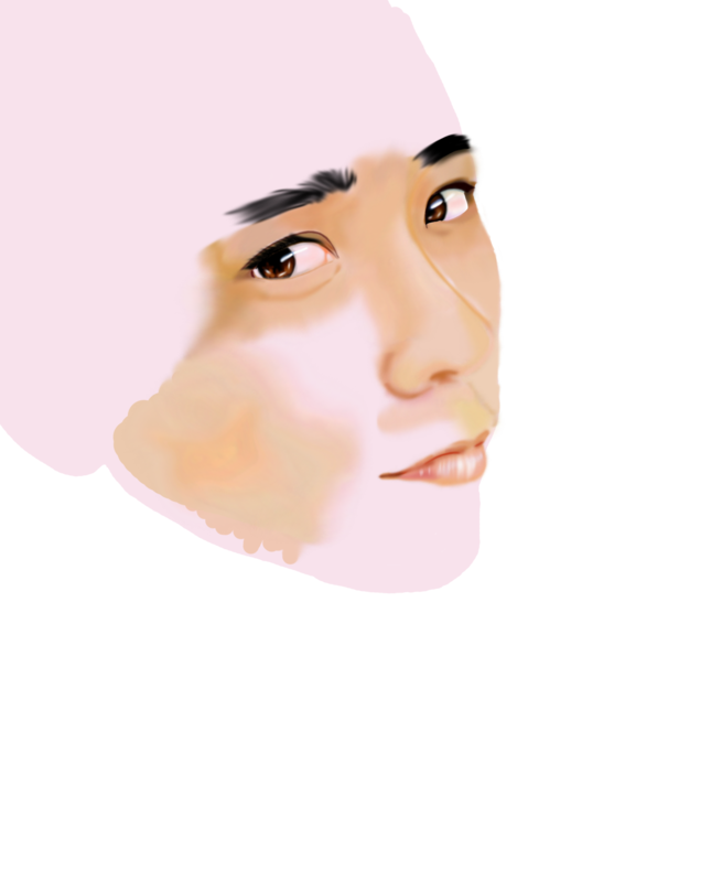
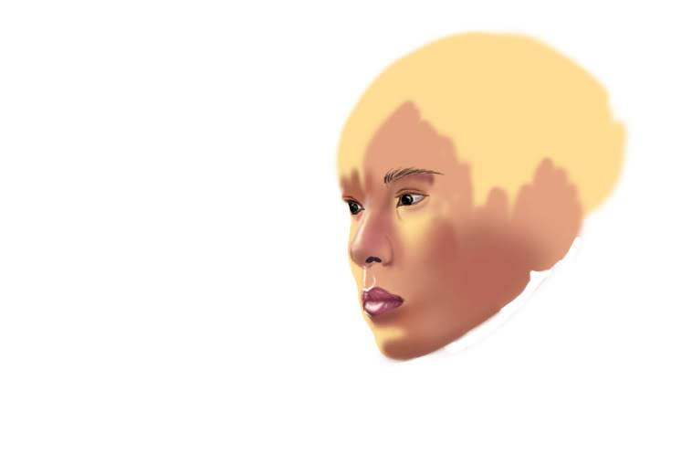
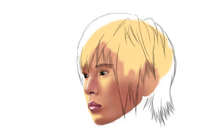
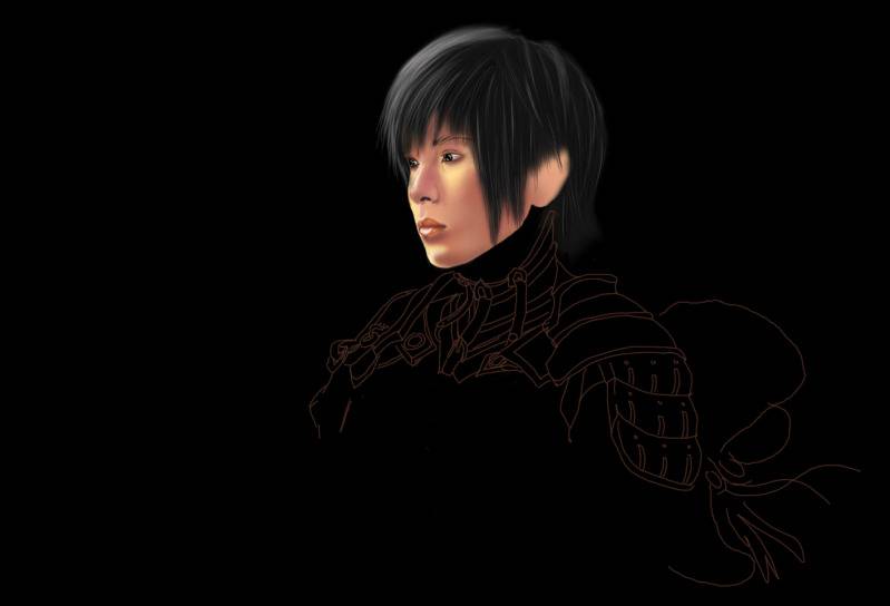
The first and last piece were based on photographs. The middle unfinished one was scratch. I feel like that one came out the best even though it's not done. I can definitely see what you mean by contrast.
I think I somewhat did that in the unfinished piece.
I've never had formal art lessons. Everything has been self taught over the years. So I probably lack a lot of basic color theory. (Perhaps I should take a class). I have difficulty choosing colors for contrast because it just looks strange to me in the "work in progress" stages. It comes together in the end, but I guess I lack the "eye" for it?? Haha
I'll start playing around w/ colors more.
Again, thank you.
Originally Posted by theReptileGuy
ARASHI & M.M.! Haha.
Really nice. Love them both, but, the first more so. Haha. The shading is really nice, and so is the texture. I really like how the first one blends in with the background more so. They're both really, really nice! Keep up the good work!
P.S.: Asian Kung Fu Generation is better. Even though it's in a totally different genre 
I really liked the older gen of MM. I'm not sure what's going on w/ any Jpop group these days because I fell out of the fandoms a while back.
I still like them. Just haven't kept up.
And AKFG is awesome too. I have a few albums.
-
Posting Permissions
- You may not post new threads
- You may not post replies
- You may not post attachments
- You may not edit your posts
-
Forum Rules
|








 Reply With Quote