» Site Navigation
2 members and 1,855 guests
Most users ever online was 54,199, 06-29-2026 at 02:43 AM.
» Today's Birthdays
» Stats
Members: 76,103
Threads: 249,251
Posts: 2,572,970
Top Poster: JLC (31,651)
|
-
Registered User
Re: Our new logo!
 Originally Posted by psychophobia
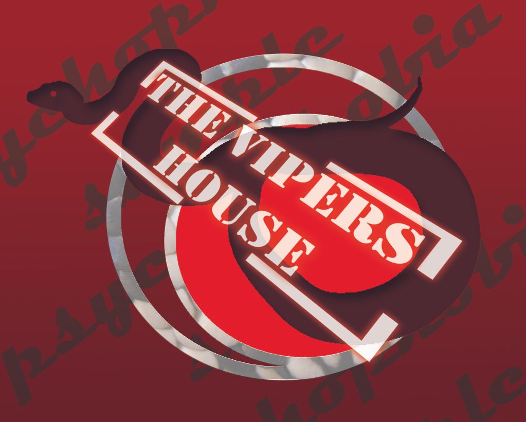
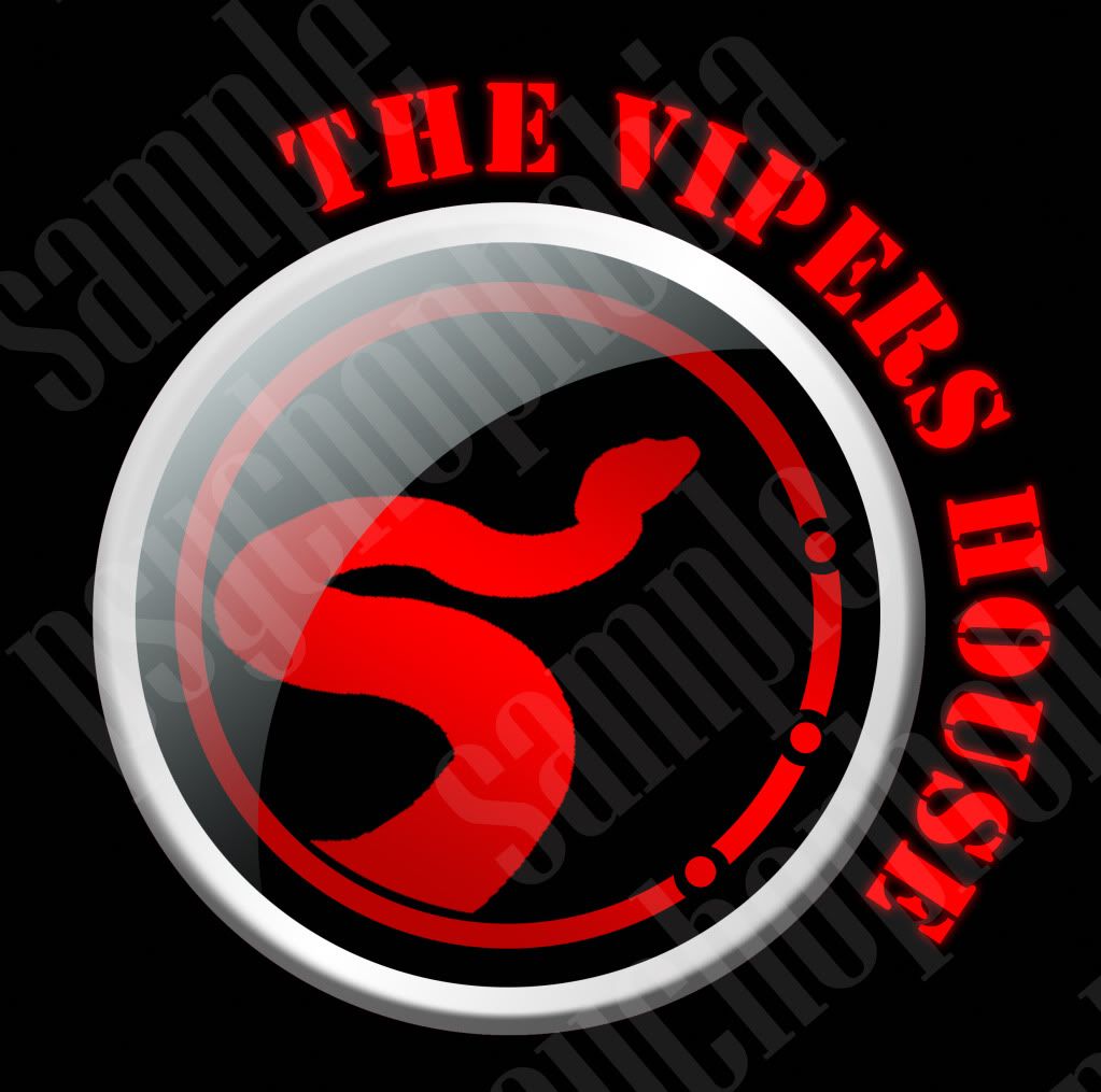
i can make something better than that.here what i make for thevipershouse.
.....hmm. That's a bit rude and probably not a good way to get business, just a hint.
Last edited by Misfit; 05-04-2011 at 01:20 PM.
Reason: Cut out the images
0.1 Albino Nelson's Milk snake
1.1 Pewter
0.1 Mojo Spider (Gaia)
0.1 Bumblebee
1.0 Lesserbee
1.1 Fire (Pele)
0.1 Axanthic VPI (Isis)
0.1 Normal
0.1 Pastel
1.0 Albino Burmese ("Bad Dog")
1.0 Wolf aka Puffball (Trapper)
1.0 Dork Boy (Roo)
-
The Following User Says Thank You to Misfit For This Useful Post:
MissDizzyBee (05-08-2011)
-
BPnet Veteran
Re: Our new logo!
 Originally Posted by misfit
.....hmm. That's a bit rude and probably not a good way to get business, just a hint.
x2
-
The Following User Says Thank You to LunaBalls For This Useful Post:
MissDizzyBee (05-08-2011)
-
BPnet Veteran
Re: Our new logo!
 Originally Posted by LunaBalls
x2
x3 dont put others work down to promote ur own will only get bad responses.
-
-
Re: Our new logo!
 Originally Posted by psychophobia
i can make something better than that.here what i make for thevipershouse.
this one is rejected:
n here the final logo:

Those aren't very good.
Just saying...
Have a nice day.
____JOSHUA____
___  ___
ROCK CHALK JAYHAWK GO KU!!
Kansas City Chiefs
-
-
BPnet Veteran
-
-
Nice lookin logo! She did mine as well!
Psychophobia....not only rude to put down others work but I don't think I've seen you complete a proper sentence since you've been posting...very professional...
Last edited by Luke Martin; 05-08-2011 at 02:41 AM.
-
-
Re: Our new logo!
 Originally Posted by psychophobia
i can make something better than that.here what i make for thevipershouse.
this one is rejected:
n here the final logo:

Meh - doesn't turn me on. I prefer the OP's logo, much more polished than yours - just saying....
Edit - I agree, it's very rude to piggy back on someone else's thread criticizing someone else's work just to promote yourself.
Last edited by rabernet; 05-08-2011 at 09:25 AM.
-
The Following User Says Thank You to rabernet For This Useful Post:
-
Registered User
Thank you for the compliments. I do work in a variety of styles and don't limit myself to just one look.
Jessica - thanks for posting the thread, I am glad you are happy with the logo
mina
1.0 bee
0.1 lesser 0.2 normal
1.1.2 r. chahoua
3.6.0 r. ciliatus
1.1.1 r. leachianus
-
-
I like the logo. Nice and colorful.
1.0 Normal (Rocko)
1.0 Mojave (Mac)
1.0 Pastel Ghost (Zeus)
0.1 Spider (Zarah)
1.0 Butter (Jagger)
0.1 Coral Albino Boa (Josslynn)
1.0 Kenyan Sand Boa (Cee Lo)
Black Cat Nivea)
Dachshund (Isabella) (Murphy) (Lilli)
Mixed Breed (Heidi)
-
-
BPnet Veteran
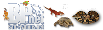
Very nice Jen! Good use of color, and balance! I love the way the eyes just pop! Their placement creates great movement bringing the viewers eyes back to the name of the company. Good Job!
-
Posting Permissions
- You may not post new threads
- You may not post replies
- You may not post attachments
- You may not edit your posts
-
Forum Rules
|